Monday, April 18, 2011

Filling spaces (just not the right spaces)

When you spend a lot of time looking at Blue Volume Ones, either in person or on the Internet, certain trends become apparent, such as which countries will usually have the most stamps and which are likely to be barren. It is also hard not to notice that certain countries and issues are frequently misidentified by collectors. Here is a look at some of the more common problems (most of which I've perpetrated myself at one time or another).

ANTIGUA & MOST BRITISH COLONIES
Most British Colonies used key types with the head of the reigning monarch. The Queen Victorias are reasonably identifiable, but collectors who aren't paying attention are likely to mistake King Edward VII for George VI or vice versa, especially where the colors and denominations are identical. On the surface of it, the "baldies" as the Edward VIIs are affectionately known should be easy to distinguish, but, of course, you often are dealing with stamps cancelled over the obvious identifying bits.

And, by the way, regular/commemorative stamps overprinted to make them function as Officials, etc. don't belong in the spaces "up front" (unless, of course, you've made the decision to let design trump use).

AFGHANISTAN
Some collectors throw up their hands at the first sight of non-Western alphabets or non-Arabic numerals. In my experience, if the collector has mis-mounted a lot of Afghanistan stamps then they probably can't be trusted with Armenia, China, the French Offices in China, the Indian Convention States, Saudi Arabia, et al.

AUSTRIA
The various profile heads of Emperor Franz Josef between 1890 (Scott 51) and 1907 present challenges depending upon whether the numerals are black, white or colored, whether the numerals are surrounded by ovals, squares or hexagons, the currency used, etc. You've got 49 spaces to get it right, wrong, or as probably in my case, somewhere in between.

BELGIUM
For the past several years I've been blithely completing a page in the Blue of Belgian Parcel Post/Railway stamps, congratulating myself as the page rapidly filled up. Imagine my chagrin to discover that many of my stamps were in the wrong place. In my last eBay purchase something or the other sent me to the Catalog to verify a stamp only to discover that practically every stamp I had mounted in the 1916-1920 spaces was wrong. So I went from having virtually every space filled for these to having only two. I'm sure there were stamps in previous album purchases that I ignored because I thought I already had them.
The top row in the album is straight forward for the stamps from 1912-14. But things go downhill for the remainder of the page. My take on this is the first two rows are intended for Q61-80 from 1916 which have the values at the bottom only. The next two rows are for Q82-102 from 1920. These have numerals at the bottom and top. They can be distinguished from the following set because their winged wheels are filled/shaded. Then the last row is for the stamps Q103-Q131 from 1920-21. These also have values at the top and bottom but have no fill in the winged wheel. (Distinguishing between the stamps with the train in all these issues is much easier than the winged wheel. As is often the case, the Minkus Global albums offer collectors more help via useful notes like "Shading on wheel-spokes" or "One head-lamp in Engine.")

An interesting survey of these stamps can be found here.

CAPE JUBY
The Blue contains several colonies like Cape Juby, Dahomey and Martinique where there are multiple pages with zero illustrations, only descriptions like "Stamps of Spanish Morocco, 1935 overprinted." Well, I suppose Scott has to sell its catalogs somehow. Anyway, the lack of illustrations is an invitation for collectors to make mistakes.

FINLAND/RUSSIA
I left this out of my original post because until now I've never taken the time to verify my own holdings. I knew there was the potential for mistakes because Finland and Russia used similar stamp types between 1891 and 1918. Turns out that I had erroneously mounted one of the Russian Ring stamps in Finland, and the original owner of my album had hinged a similar Finnish stamp underneath the correct stamp in Russia. So all in all, not too bad. It also makes me feel better because in looking for suitable illustrations, I found some misidentified stamps on other web sites.

For Finland, here is the breakdown for the stamps in the Blue Volume One:

1891-92 Scott #46-52
Denominations are in Kopecks so that doesn't help to differentiate from the Russian issues. Look for the circled dots along both sides of the ring or in the corners.

1901-03 Scott 64-68
Finnish stamps will be denominated in Pennia, not Kopecks, or, in the case of #68, 1 Markka (which, as we all remember from Elementary School, equals 100 Pennia).

1911 Scott #77-81
Finnish stamps will be denominated in Pennia, not Kopecks.

There are more examples in this Stamp Identifier.

For Russia, just look for stamps without the circled dots or denominated in Pennia, Markka.

FRANCE/FRANCE COLONIES
The second space for France is intended for the 25 centime blue from 1849-50, Scott #6. However, what is usually in the space is the rather more common French Colonies #12. A number of early French stamps are difficult to distinguish from those intended for the French Colonies which didn't have their own stamps. While this isn't the fault of the Blue's editors, it would be nice in this and similar cases if there was some sort of caution in the album to send collectors to the Catalog. Minkus did this for France in their Master and Supreme Global albums: "For other stamps with the following designs see French Colonies--General Issues."

GREAT BRITAIN
No one reading this column is going to make this mistake, but you'd think that the Penny Black is sufficiently iconic for all collectors that the space for it would either contain the right stamp or be blank. So I'm surprised how often the wrong stamp is in the space--usually one of the Penny Reds, on occasion even perforated! If someone wanted to fill the space while waiting for the Penny Black fairy to come through, there are always the many stamp-on-stamps of the Penny Black, such as the 1990 Great Britain miniature sheet issued on its 150th anniversary.

ITALY
I've yet to see a Volume 1 that had the correct stamp for Italy in the space described as "Type of 1862, Imperforate." Assuming that it isn't blank, the stamp in the space is invariably #23 or #23a, not #22 with the head embossed from 1863. Although the description in the current Blue is technically correct, it was a little more obvious in earlier editions which had 3 earlier stamps similar to the stamp that belongs in the space. These three 1862 stamps are missing from later editions.

LATIN AMERICA
I have made no attempt in my own collection to try to weed out "the Seebecks" and probably won't until I get to the point of needing to make more expensive purchases. If you are unfamiliar with this topic, check out Keijo's blog post: http://www.stampcollectingblog.com/seebeck-reprints.php

PERSIA
The Blue I first purchased was probably 90% complete for Persia. However, I have read many times that much of the Classic Era Iran typically found in collections are counterfeits/reprints/forgeries. So I'm saving until some future date (if ever) trying to make sense out of what I have.
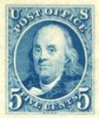
UNITED STATES
I'm not going to talk about the USA even though grills, secret marks, and watermarks offer much opportunity for, shall we save, creatively filling spaces. Just watch out for albums with Blue 5c "1847" Franklins!

Wednesday, March 30, 2011

Half way there

One of my New Year's Resolutions was to fill my Scott Volume 1 to the 50% point this year or 17,500 stamps. I knew that setting such a goal was going to take me out on a limb as I was about 2000 stamps short, but an unexpected album purchase yielded an even more unexpected 1889 stamps for my collection; that put me just over the half way point when added to some smaller purchases. I intend to blog later about the purchase that made this possible because I think it has some implications for other collectors, but for the moment, I thought I would make a few observations about what a half completed Blue Volume One album "feels" like.

When I started my collection was under 10,000 stamps. In the first 200 pages there were 35 pages with no stamps on them. Now there are seven. In general, there aren't a lot of pages that feel sparse.

And some of the larger countries are approaching completion--at least aside from those pesky semi-postals and "offices." From the first part of the alphabet, Argentina, Austria, Bavaria, Belgium, Canada, Chile, Czechoslovakia, Egypt, France, and Germany are down to no more than a dozen or so missing regular issues/commems.

In spite of being at the halfway point there are still a bunch of countries for which I haven't a single stamp. I had blogged in May 2010 that out of 408 countries/political entities in the Blue, there were a surprising 76 staring back at me with only empty spaces. Now with the album half full, I am lacking stamps from 53 countries. I'm still not clear as to why there should be so many. For example, although my holdings of Italy were good, I was able to score 66 additional Italian stamps from my latest eBay purchase. But even though the original owner of this album obviously had a good collection of Italy, he or she didn't have a single example of Italian Occupation stamps from Calchi, Calino, Caso, et al, in spite of the fact that there are many of these that catalog under one dollar each. A similar story could be told for plenty of other countries. So this reinforces my impression that there are dozens of countries that elude most Blue collectors for reasons other that cost.

The next major milestone I guess will be 20,000, but who's counting :)

Sunday, March 13, 2011

The Strange habits of eBay sellers


It's already mid-March and I'm chagrined that I haven't posted anything yet for this month. In my defense, I've actually been working on my collection every day and will have a couple of posts related to this, but not for another week or two. So in the meantime I thought I would write on a generic topic, specifically about some of the stranger things perpetrated by eBay sellers of Blue Volume Ones.

Right at the top of the list are those sellers who say that the Volume Ones they are offering are "unique" and that these albums are rarely offered on eBay. Have they really not done any research? I wouldn't be surprised to learn that there is never a day that someone doesn't have a Volume One for sale. So are the sellers who make such claims clueless or …?

Somewhat related are sellers, almost always ones who admit being unfamiliar with stamps, who think the albums themselves are valuable for their maps, spaces for rulers and flags, etc. They lovingly photograph the bindings, title pages, and advertising materials. They go into rapturous detail about how the album is an homage to dead countries and bygone times. But about the stamps, if there are any, not so much.

And what about the sellers who go to the trouble to take photographs, but these are too blurry to show condition and sometimes even identify what stamps are being depicted? And we are not talking about one or two fuzzy-wuzzies. There are at least a couple of sellers who have on multiple occasions uploaded dozens of blurry photographs.

And then there are the sellers who have the focus thing down but only include a small portion of the album page in the photo. (I'm not talking about providing detailed photos of the valuable stamps which are always appreciated.) Perhaps there are photo-hosting sites that charge by the square inch?

I don't see it too often, but don't you love sellers whose take photos of entire pages but who upload the images randomly out of order? Like many of you, I suspect, I compare the images of prospective purchases against my own collection and there is nothing like seeing a page of Zanzibar followed by Aden followed by Switzerland followed by Belgium.

And finally there are the many approaches taken by sellers as to the number of stamps in their albums. I particularly like the sellers whose titles say something similar to "Bulging album bursting with stamps." Then when you get to the fine print of the description you see a phrase like "there are hundreds and hundreds of stamps." As the Blue contains thirty-five thousands stamps, don't they know that an album containing hundreds of stamps is 98-99% empty? Not exactly bulging. To state the obvious, even in an album containing 3500 stamps, 9 out of every 10 spaces would be blank.

And how about the sellers who not only do not give a count but go out of there way to say that "no, they won't count them, so don't ask"? (Of course, some of the most prolific sellers rarely give counts, preferring to supply hundreds of page shots instead. Thank goodness, because most of their textual descriptions are cookie-cutter and next to useless.)

No doubt you have others that could be added.

Sunday, February 27, 2011

International Blue-per #7: Denmark Caravals

As Jim is doing such a thorough job in his "Big Blue 1840-1940" blog going through Volume 1 country by country, I'm going to stop listing "minor" problems with the album. But in adding some stamps to Denmark, I came across a type of Blue-per that I hadn't seen before, namely a stamp cut that is completely wrong.


It is clear from the dates and descriptions that what is intended for these spaces is the 1933-40 Caravel ship definitives. But the cut is from one of the 19th century "Numeral" issues and doesn't belong here at all. And now that we are looking at this more closely, why are there spaces for the Type II Caravels from 1933-40 (Scott 283A-238J) and the 1927 Caravals on the previous page but not the Type I Caravals from 1933-34 (Scott 232-238)? I don't know that spaces for both of the types are needed, but the descriptions could have been worded so that either Type I or Type II stamps would fit.

Curiouser and curiouser is that this entire page is missing from my 1943 reference volume which stops with the 1937 series for the 25th anniversary of King Christian X's accession (i.e., the previous page in all subsequent editions). So it appears that the 1943 and 1947 editions of the Blue Volume 1 are not identical.

Wednesday, February 16, 2011

OMG! There is A New Blue International Volume 1 Blog

Fellow collector Jim has just started a new blog with the great name "Big Blue 1840-1940" and a catchy intro: "A is for Aden and Z is for Zanzibar...Now what is between? Darn if Scott knows. Fact: Scott does not provide information for what is in Big Blue, aka Scott International Volume 1 1840-1940 But that is about to change."

Jim has set himself the ambitious task of creating a guide to the contents of the Volume One. And we're not talking about just a list of Scott numbers, but also information about the country and background on the stamps themselves.

I wish Jim the best of luck with his new endeavor which will benefit all stamp collectors with an interest in the classic era.

Here's the link: http://bigblue1840-1940.blogspot.com/

Tuesday, February 15, 2011

Thoughts on a Checklist for the Blue Volume 1

Jim's comment a few days ago about creating a checklist for the four part version of the Blue got me to thinking about my own "experiments" with such a list awhile back--which went nowhere, I hasten to add. When I began my Scott Volume 1 collection, my fervent hope was that someone had made a checklist and put it on the Internet or donated it to a library. Unfortunately, I've never found one.

Why a checklist? When you are dealing with 35,000 stamps, it would be nice to have a convenient way to keep up with what you own, have something to take to stamp bourses or check against websites, provide documentation for insurance, etc. Also, such a list could help identify what stamps are not depicted in the album but logically should be and to generate statistics (e.g., what is a total catalog value of of a complete Blue Volume 1, what are the most expensive stamps, etc.)

Most serious collectors, I would hazard, pencil catalog numbers in their albums as their collection progresses. I have even heard of collectors taking their albums to dealers so the album itself becomes a checklist. That is too much of a bother for me, but, in any event, ones' annotated album doesn't do other collectors any good.

I know that some collectors annotate their copies of the Scott Classics Catalogue but I haven't found a good way to mark the glossy paper. Pencil doesn't show up and pen isn't mistake or update friendly. Also, even though the Classics Catalog is a single volume, it still is cumbersome to drag around, at least in comparison to a checklist. Now, I do have the 2007 version of the Classics Catalogue on my iPad which would be handy to take to stamp shows, and it is easy to highlight catalog numbers (I use the GoodReader software). If I only wanted something to show what I owned, this might be a sufficient solution. But the downside is that the highlighting can't be used in any other context. That is, I can't use the highlighted pdf to update more recent versions of the Classics Catalog. Nor can one extract the highlighted items to use for other purposes.

So compiling a checklist from scratch still seems the best solution. To that end, I played around with various formats a while back to see what issues would be involved. The basic questions seem to be:

--How do you format the listings: vertical or horizontal?
--How do you allow for indicating that you own an item without taking up too much space?
--How much information should be included (Scott catalog number, year, denomination, color, description, other publishers' catalog numbers, etc.)?
--How important is it to indicate that stamps belong to a set/series, and skips within sets?
--How to indicate that a page has blank spaces and what goes in these spaces?

Here was my first attempt at a minimal checklist format that would take up as little space as possible.

USA 1-2, 9-11-blank, 24-26-35, 63-65-68-69-73-76-78. 92-93-94-96-97-98-blank, 112-113-114-115-116-117-blank, etc.

I started with USA as Scott had already done much of the work for me. I first figured it made sense to use standard symbols such as the hyphen for stamps in a set, but it dawned on me that simply indicating a set contained say numbers 143-160 wouldn't give the collector a way to indicate which of the stamps in the set they owned. With the set numbers broken out, you can check, circle, highlight the individual stamps as required. Commas are used to separate related sets/series.

One obvious problem is how to deal with the situations where Scott has provided one or more blank spaces. Usually these are for higher values in a set but on occasion they could be for any stamp that fits and falls within the date range/description. My first format attempt simply indicated the number of blank spaces but I began to wonder if it would be of more use to list the possibilities for filling the space. Here is a variation that attempts to solve this:

USA 1-2, 9-11-blank for 5-8/10/12-etc.

Well, that didn't work out so well. I didn't come up with a good solution except where there was a contiguous series of stamps (see the China example below).

Although not shown in any of my examples, in hundreds of places in the International there is more than one possible stamp that matches the cut or description. Scott uses the word 'or' to indicate this in the US section: for example, 187 or 188. I thought about abbreviating this with187/188 but as the slash traditionally means something else in dealer/auction catalogs so that probably wouldn't be a good idea. The problem with 'or' is that in some cases you have 3 or even 4 stamps that could work. So that issue isn't resolved.

As long as you are looking for stamps from a seller that uses Scott Catalog numbers, you're all set. But once you are on sites like Delcampe where many of the sellers use other numbering systems, then you are out of luck. I think we can eliminate the possibility of identifying each stamp in the checklist by Scott, Stanley Gibbons, Michel, Y&T, etc. Even if one had the resources to make such a list, we know that Scott/Amos Publishing in particular would never allow such cross-referencing.

But regardless of seller, what most of these services have in common is that generally the year and sometimes denomination are included in the title or description. If I'm searching for a stamp that I know was issued in 1924, then I can add to that to my search string and get around not knowing the catalog number. So here is a modified version of the above with just the year:

USA 1847 1-2, 1851-56 9-11-blank, 1857-60 24-26-35, 1861-67 63-65-68-69-73-76-78, 1861-67 grills 92-93-94-96-97-98-blank, 1869 112-113-114-115-116-117-blank

One issue is whether to include a year range for sets (either from the album or the catalog) or specifically indicate the year for each individual issue. Going the latter route significantly adds to the work and I'm not certain whether it significantly improves the accuracy of search results.

Here is the sample with denominations:

USA 1847 #1 5c, #2 10c 1851-56 #9 1c, #11 3c, blank 1857-60 etc.

Actually, the "blank" seems to me to work better here. That is, my assumption would be that the word blank means you can pick any other stamp issued between 1851-56 without the checklist having to specify the actual catalog numbers.

Here is an example of a vertical format that I tried with China:

___ (10) 1885 1c
___ (11) 1885 3c
___ (16) 1894 1c
___ (18) 1894 3c
___ (78) 1897 1c on 3c
___ ( ) 1897 [1 selected from #79-85]

([The ___ was intended to provide a space for a checkmark, or a u for used, etc.)

Even though I think the vertical arrangement would be easier to mark up, this approach takes considerably more space. "Vertical" China requires two pages using three columns per page as opposed only part of a page horizontally:

CHINA 1885 #10 1c #11 3c 1894 #16 1c , #18 3c 1897 #78 1c on 3c, two blanks

Seems congested but I might get used to it.

A quick and dirty estimate suggests that a horizontally formatted checklist for the 35,000 stamps in the Volume One would take up 70 single sided pages, assuming 500 stamps per page. Not a big deal to carry around in a small binder.

I can always come up with excuses for why I never got around to doing more with the checklist, but I suppose the main reason is the hope that Scott will put their catalog online in a way that could be used for generating at least the raw data needed for a checklist. We know that they are in the process of creating an online catalog, just have no idea as to the details.

Any ideas and thoughts on formatting would be most appreciated.

Saturday, February 12, 2011

Unsung Heroes of the Scott Catalogue and a Hint of Things to Come

I've praised the Scott Classics Catalogue many times in this blog, but had little idea of who the people were behind the endeavor. An article in the February 21, 2011 Linn's helps put a face on its staff. According to the article, Bill (William A.) Jones has been the guiding force behind the catalog "to the point that where one could almost say it became his catalog." Mr. Jones has now retired and Donna Houseman has taken over many of his responsibilities. Ms. Houseman has worn several hats at Amos Publishing, including editor of the Scott Stamp Monthly. Stamp dealer and expertiser Sergio Sismondo continues to be a special consultant.

Although not specifically associated with the Classics Catalogue, Associate Editor Dave Akin is the "point man" in efforts to bring the Scott catalog online. The article promises that we will be hearing more about this project in the coming months.